Ask anyone with an e-commerce site what’s one of their main pain points, and abandoned carts will probably be toward the top of their list. It hurts to see a shopper add a product to their cart, only to leave your site before ever following through with their purchase. (That's why we're going to give you tons of abandoned cart examples!)
Cart abandonment is an issue no matter your brand’s industry or size. The average cart abandonment rate is 70 percent, and some companies have rates above 80 percent. So yea, abandoned carts are a big issue.
While these numbers may seem high and overwhelming, there are several things you can do to help lower yours and help people complete their purchases. That’s why we’ve put together tips, techniques, and abandoned cart examples that will push shoppers to convert.
Here’s some of what we’ll cover in this guide:
- Why do online shoppers abandon carts?
- How to eliminate cart abandonment excuses
- 23 abandoned cart examples
- Abandoned cart best practices
To stop shoppers from leaving their carts before making a purchase, you first need to understand why this happens so you can then fix or prevent the issue.
Why do consumers abandon their carts?
To create a compelling campaign that drives them back to your site to finish their purchase, you first need to understand why they abandoned their cart. While you aren’t going to know each shoppers’ specific reasons for leaving (unless they leave you feedback, which is amazing!), you can learn about the most popular causes of cart abandonment.
Then, take steps to prevent or reduce the issue so that they don’t have a reason to leave their items unpurchased. (These can also help with browse abandonment.)
These are the Top 10 reasons online shoppers abandon their carts:
- Extras cost too much (shipping, taxes, fees, etc.): 50 percent
- Site wants them to create an account: 28 percent
- Too long or too complicated of a checkout process: 21 percent
- Couldn’t see or calculate the total order cost up-front: 18 percent
- Delivery was too slow: 18 percent
- Didn’t trust site with credit card information: 17 percent
- Site had errors or crashed: 13 percent
- Returns policy was unsatisfactory: 10 percent
- Weren’t enough payment methods: 6 percent
- Credit card was declined: 4 percent
Luckily, you can do something about most of these issues.
Proactively fix cart issues
Now that you understand what causes them to ditch their carts, you need to focus on eliminating those reasons as much as possible. We’ll dive into each reason shoppers abandon their carts and give you a way to prevent those issues from happening.
Extras cost too much (shipping, taxes, fees, etc.).
If a shopper puts a $20 item in their cart and then sees a $40 total when they go to check out, they’re not going to be too happy about it. That’s because it’s unexpected. And instead of searching to see what all of those extras costs are, they’re probably just going to close out of the site.
We know not all fees are avoidable (though you can include some of those costs in the product cost so there are fewer surprises). If you have to include them, let them know before they ever get to their cart. For example, run a banner at the top of your page that says “Shipping starting at $4.99.”
They shouldn’t be too surprised by taxes since those are pretty much the same across the board, but do what you can to eliminate other fees — or at least let them know earlier.
Site wants them to create an account.
Consumers want the checkout process to be as quick and painless as possible. They don’t want to spend another five minutes filling out your forms to create an account after they’ve added items to their cart: They’re ready to make a purchase and be done.
So, instead of requiring them to create an account before checkout, give them the option to checkout as a guest. That saves them time if they aren’t interested in creating an account with your company right now.
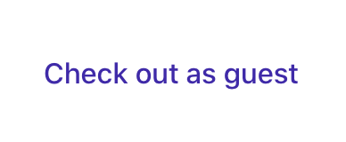
You can, however, let them know if they create an account, you will save their information (address, billing, etc.) so that it’s all there for the next time they make a purchase. That allows you to put the decision on them.
Too long or too complicated of a checkout process.
Again, this goes back to people wanting the process to be as quick and easy as possible. Don’t make them jump through a dozen hoops to make a purchase. Only ask for the information you need (ex. address, billing, name, etc.), and keep it all on one screen so they know how much they will have to do.
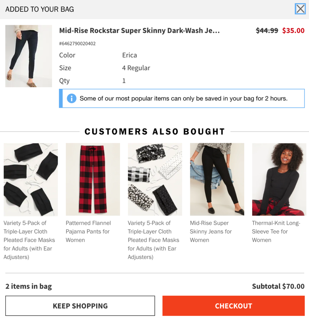
Couldn’t see or calculate the total order cost up-front.
No one wants to open their cart and see a total price they weren’t expecting (unless it’s lower, of course). And no one is going to keep a running tally in their head of how much all of their items cost.
To help them keep track of their costs, show them a pop-up similar to what Old Navy does in this example. They show the product details for what was just added, along with the subtotal for all of the items in their cart at the bottom.
Delivery was too slow.
We know delivery is a tricky thing right now during the pandemic, but that won’t always be the case — and people want their items, like, yesterday. So, offer them different shipping options with different pricing options for each. Let them control how quickly they want to receive the package and if they’re willing to pay more for it to come sooner. If it’s a priority to them, they will pay more to have it shipped earlier.
Didn’t trust site with credit card information.
A shopper is only going to give their personal information to someone they trust. So, it’s important you build that trust with them before they go to make a purchase. Here are a few ways to show consumers it’s safe to give you their information:
- Create a professional website — so no typos, clean design, etc.
- Include a physical address for your business.
- Build a relationship with the consumer (ex. email campaigns, social media, etc.).
- Include verification information that shows their payments are secure, like in this example.

Site had errors or crashed.
It’s pretty obvious someone isn’t going to complete their purchase if the site isn’t actually working. We know all bugs can’t be prevented, but make sure you go through the checkout process to identify any possible issues. And when there are errors or the site’s down, show customers a message that you’re working to get the issue resolved.
Returns policy was unsatisfactory.
Making a purchase online can be a bit scary for consumers, considering they’ve never seen the product in person. That’s especially true if they’ve never made a purchase on your site before or the item costs a little more.
Make sure to state what your returns policy is on the cart page and on your homepage. For example, you could put a banner that says “Free returns within 60 days” on your page, or whatever your policy is. Many brands are also extending their returns policy right now due to COVID, so you can also do that to show you care about your customers.
Weren’t enough payment methods.
People like options. And when it comes to payment options, you want to give them enough so that one fits their needs. In addition to the major credit cards, you can also include methods like PayPal.
Credit card was declined.
We know you can’t control if a customer’s card is declined. But by offering a variety of payment methods, like we just mentioned, that may help them find an option that will work for them.
Of course, you can do all of the things on this list and still experience cart abandonment. Maybe they found another product they liked better, or they were never that serious about making a purchase.
However, by fixing these abandoned cart examples and reasons, you can greatly reduce your abandonment rate. Once you’ve taken the time to resolve those potential problems, you can move on to focusing on bringing shoppers back after they abandon their carts with these email marketing techniques.
23 abandoned cart examples
One of the best ways to convince consumers to visit their carts and complete their purchases is with email campaigns. And we’ve got plenty of abandoned cart examples to show you!
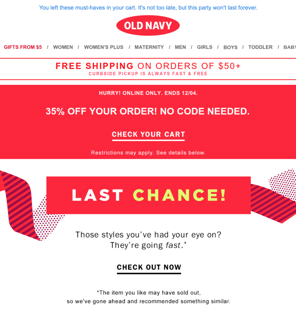
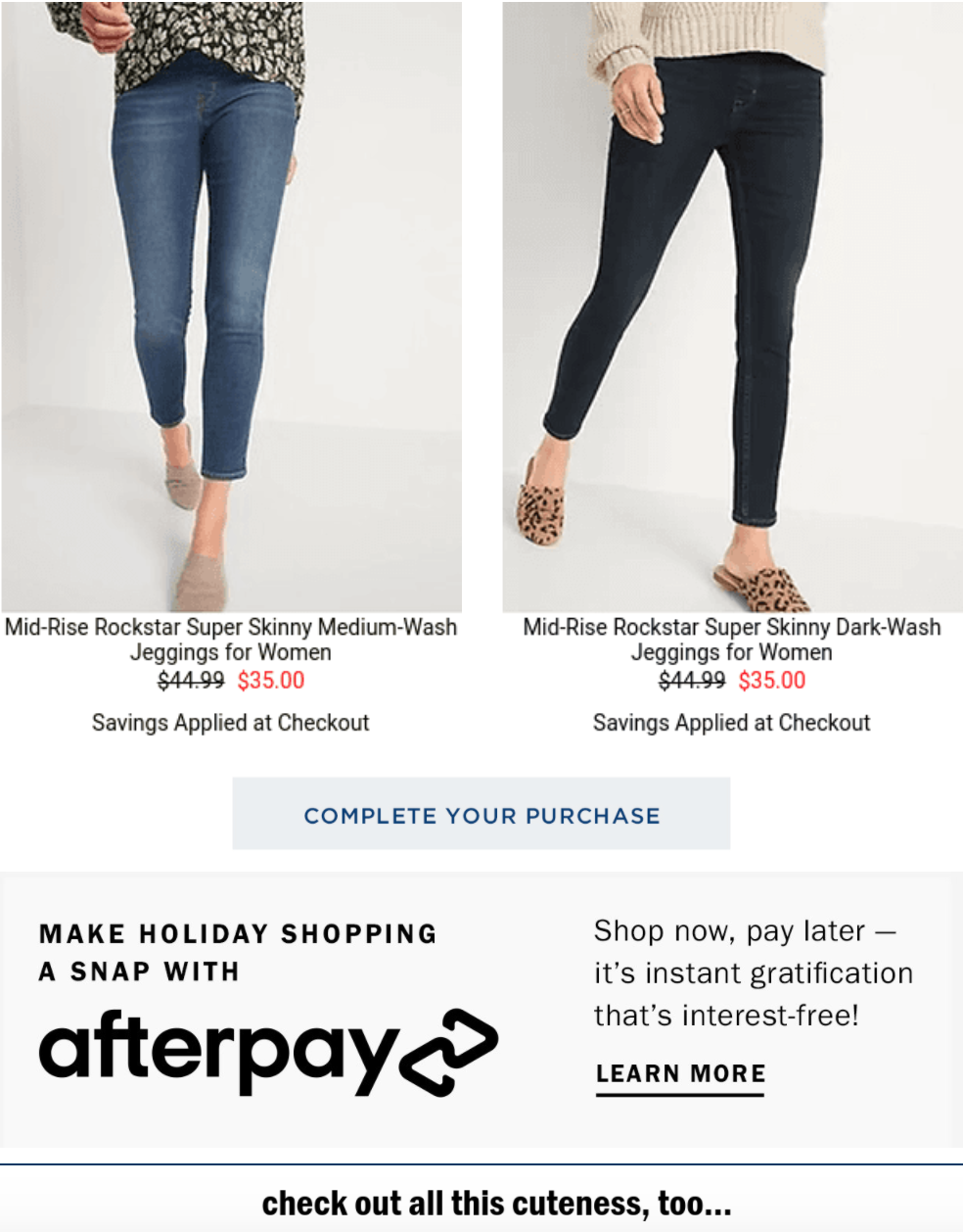
1. Old Navy
- Subject line: Your order is pending...Please confirm: Your cart has something in it.
Remember the example we showed you above from Old Navy about giving the cart subtotal whenever a shopper adds an item to their cart? Well, this is the cart abandonment email we received after leaving those items behind. It arrived a day after we put the items in the cart and exited the site.
Here are some of the things we love about this abandoned cart example:
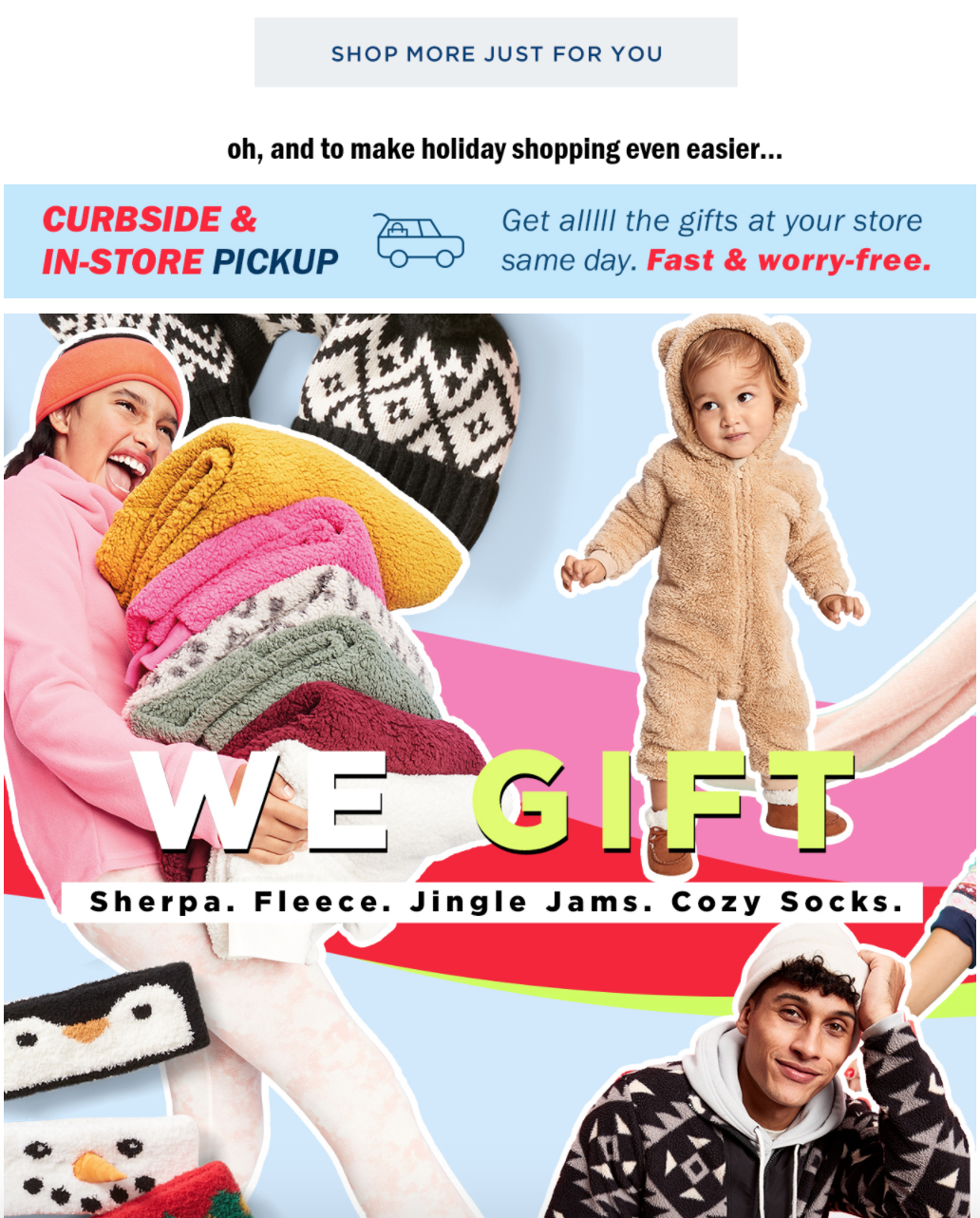
- They put information about their shipping and free pickup options at the very top.
- They have also applied a 35-percent off coupon that doesn’t require a code.
- There’s an interest-free payment option.
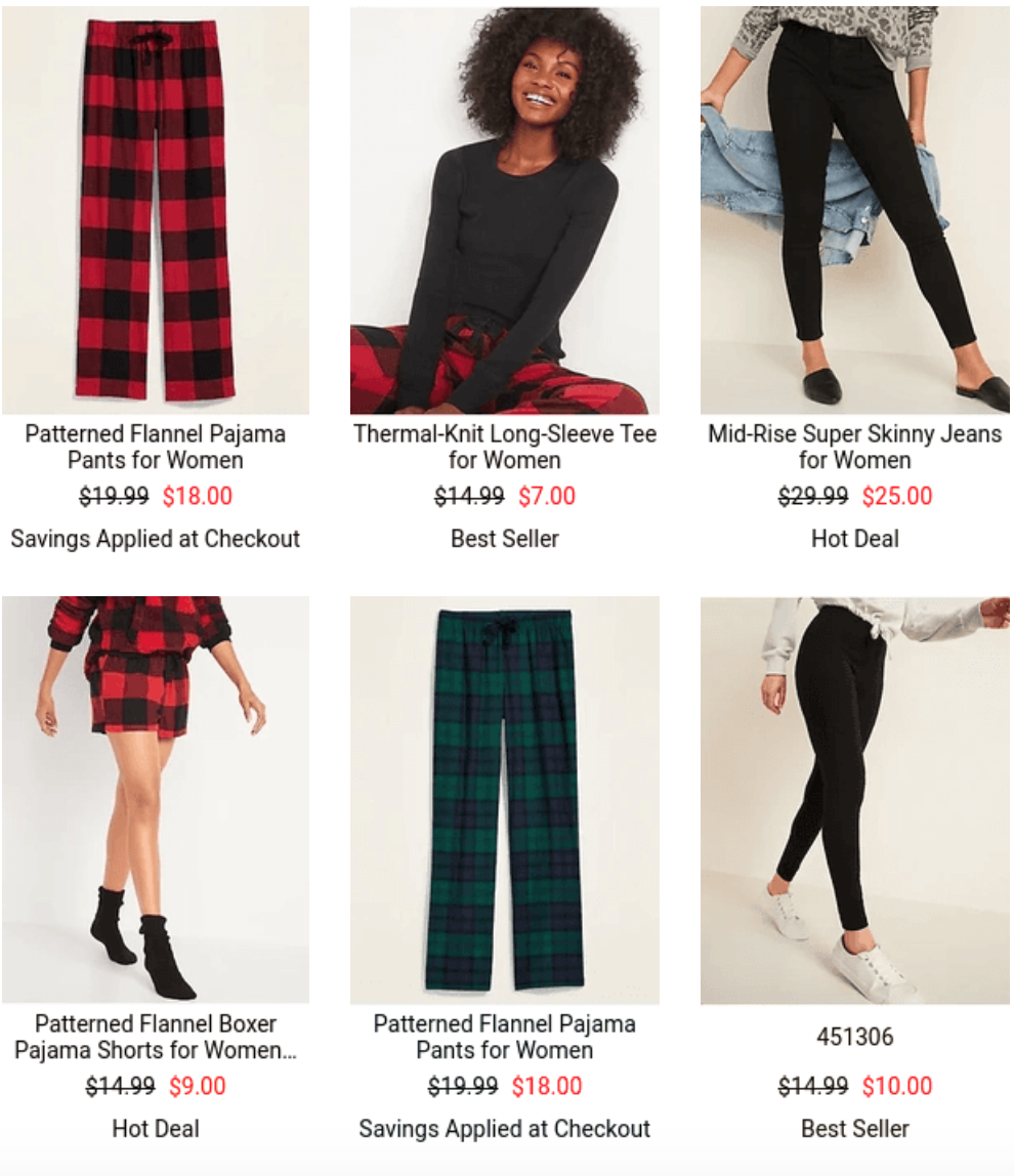
- Shoppers can see a recommended products section based off of their other product views.
- Since this email was sent around Christmas time, they also feature how their products make great gifts.
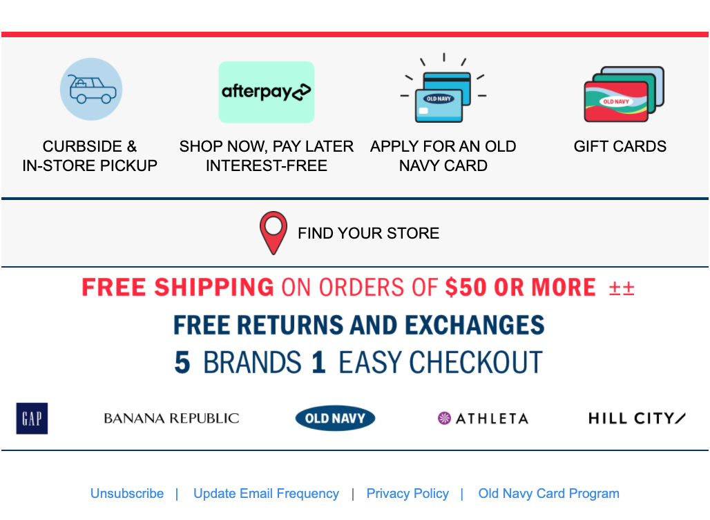
- At the bottom, they sum up all of their selling points: curbside/in-store pickup, interest-free payments, store credit cards, and gift cards.
This email really packs a punch in terms of content, photos, design, and touching on some of the main issues that could have caused the shopper to abandon their cart.
While we are pleased with the email overall, here’s something that could have taken it one step higher:
- They could have sent the email sooner. You don’t want your shopper to forget they added the items, and you definitely don’t want them to complete their purchase on another site.
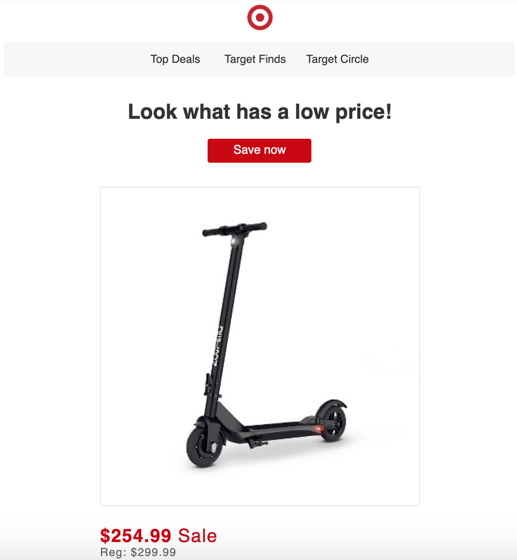
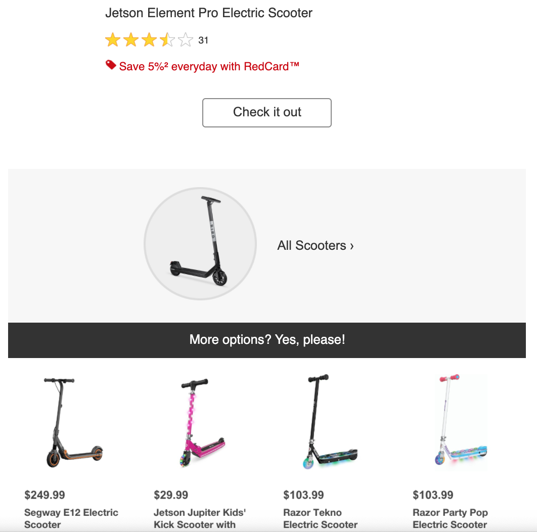
2. Target
- Subject line: The price dropped for something you added to your cart.
Here’s another abandoned cart email example that was sent about a day after we left a product in our cart. Target likes to use a popular tactic of reminding them about the product by lowering the price. Check out these other techniques used in the email:
- The “Save Now” CTA shows them again that the product price has dropped (instead of the generic “Shop Now” or “View Your Cart”).
- They put the product front and center.
- There’s information on how they can save 5 percent more by using Target’s RedCard.
- The star rating shows them what other buyers think of the item.
- There’s also a section that features other similar products.
- Finally, they wrap up the email with the other sales the store has going on.
Whatever they left in the cart should be the main focus of the email. However, we feel like this email would be better if:
- The product photo was smaller or left/right-aligned so the text/price about it could be included on the right. That would have allowed the reader to see more information without scrolling as much.
- It could have been sent sooner.
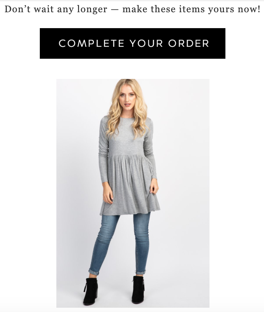
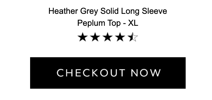
3. PinkBlush
- Subject line: You’ve got great taste.
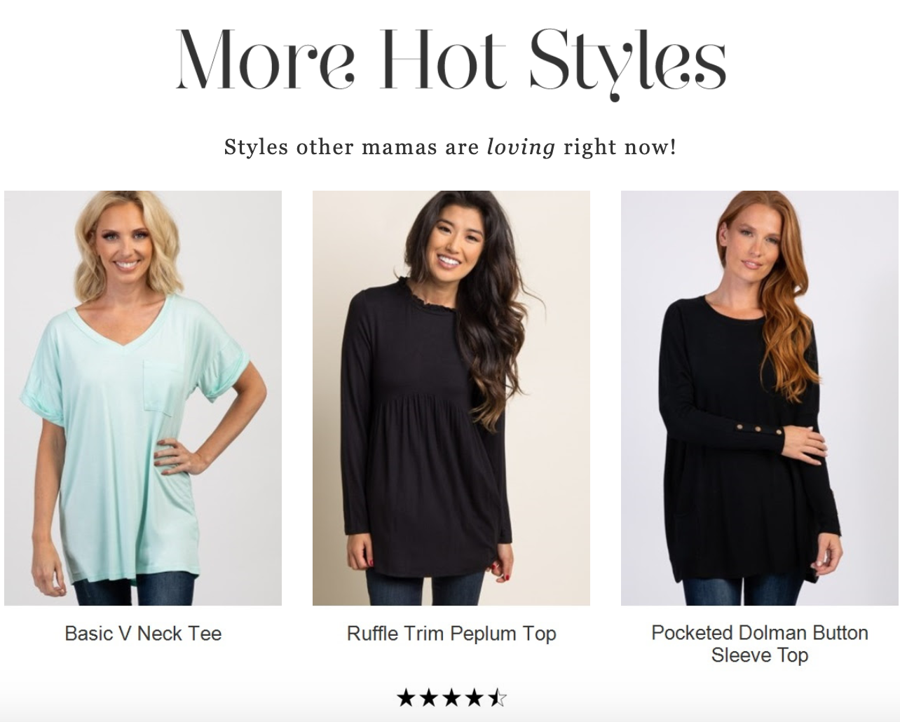
This email from PinkBlush mixes a sense of urgency with showing the customer what styles are popular right now (and reminding them they have great taste). From “There’s Still Time” and “Don’t wait any longer” to “More Hot Styles,” this email packs a punch with a simple approach.
The brand also uses social proof by showing other popular items, along with a star review for them. That’s a great way to get them back to your site if they weren’t sold on the original item in their cart — or as an up-selling tool.
And here are some other things we love:
- They show the clothes on models, which helps a shopper get a better idea of what they will look like on them.
- The “Complete Your Order” CTA makes it clear why the shopper is receiving the email.
- There’s a star review for the item that was left in the cart, along with another “Checkout Now” CTA.
One thing this email is missing:
- If they had included prices for the products, this email would have leveled up in our opinion. Even better would have been showing the original price with it marked out, revealing the discounted price the customer will pay.

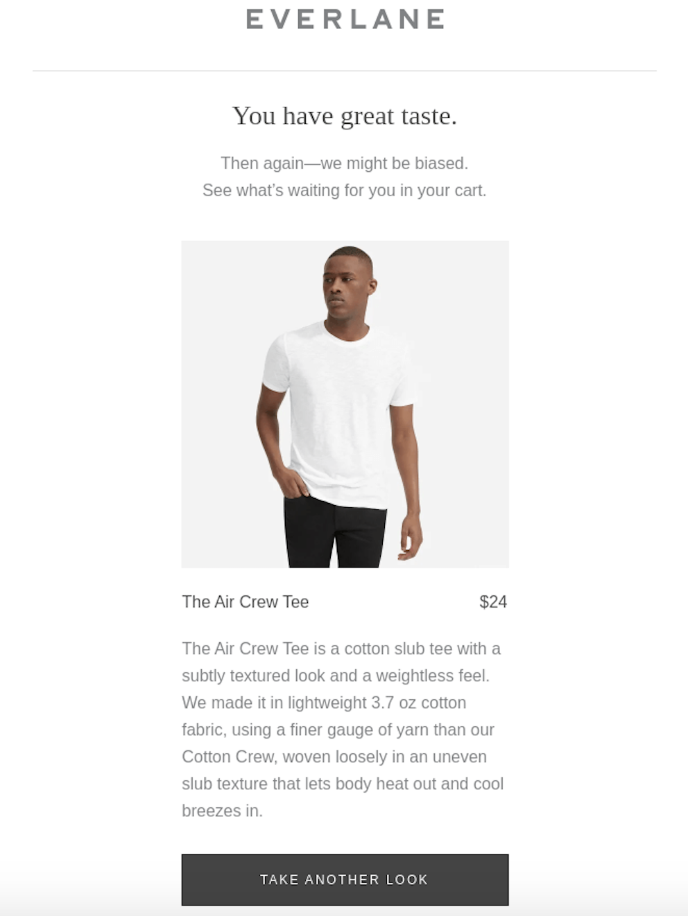
4. Everlane
- Subject line: Eyeing Something?
With a clean, simple design, this email perfectly matches the look and feel of the brand’s website. Everlane sells timeless pieces that go right along with this email campaign. There’s not as much to look at in this example, but there’s still plenty to enjoy about it:
- Again, we like when the product is shown on a model, since it’s clothing.
- They included a detailed description of the product, which isn’t something you see in most abandoned cart examples.
- The price is right there next to the product name.
To make this email even better, they could have done these things:
- For the subject line, it would have been nice to see an eye emoji.
- Move the “Take Another Look” CTA higher up so they see it sooner.
- They could have added a few similar products to provide more content and options.
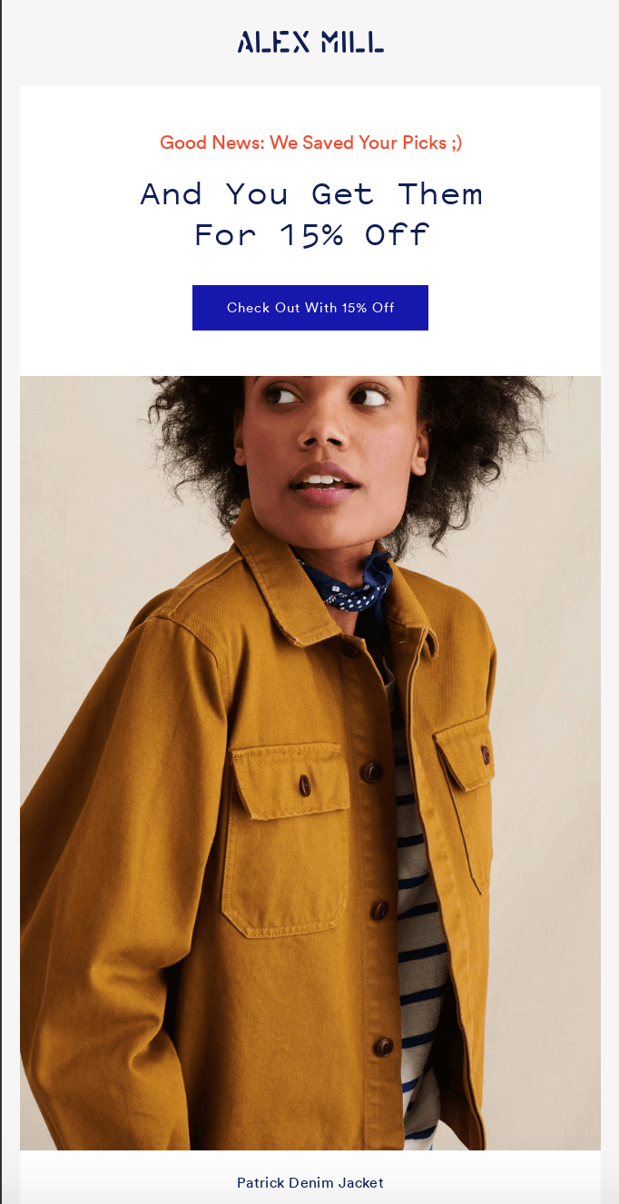
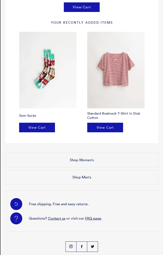
5. Alex Mill
- Subject line: Get Them for 15% Off!
When a shopper opens this email, it’s clearly from Alex Mill, and we aren’t just talking about the logo that’s at the top. The font also matches what’s on their website, making the email a cohesive extension of the brand. A few other things we liked about this email include:
- We always love a discount, so leading with that in the subject line and using it in the CTA makes sure the shopper doesn’t miss it.
- They address consumers’ concerns about shipping costs and returns at the bottom.
- There’s also a way for them to contact customer service if they have questions. And who knows: Maybe what kept them from making the purchase was a question.
- There’s a CTA at the top and bottom, giving them something to click no matter how far they’ve scrolled.
What we think would make this abandoned cart example even better:
- The subject line could have been a little clearer, stating the category or product that is discounted, instead of “Them.”
- Though multiple items were added to the cart, only the jacket was shown as the main image. The other products are included below, so you might be taking a little bit of a gamble deciding which one to feature at the top.
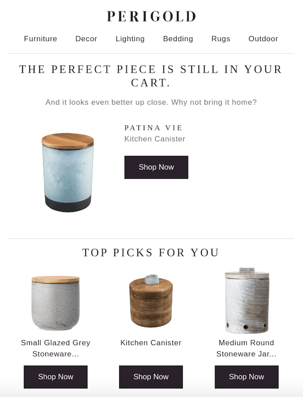
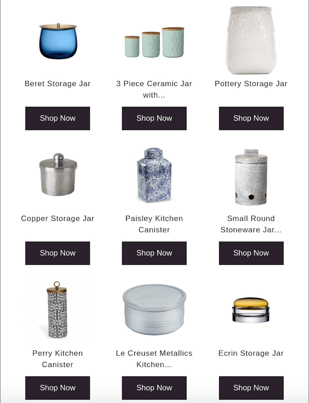
6. Perigold
- Subject Line: The Kitchen Canister is in your cart
Perigold leads off the email with, “The perfect piece is still in your cart,” in large text. That’s then followed by a smaller font that reads, “And it looks even better up close. Why not bring it home?”
We like how they have the main text and then more copy below that. There’s also a menu bar at the top so shoppers can easily access any of the brand’s departments. Check out these other components we’re vibing with:
- They include what product was left in the cart in the email subject line, so there’s no doubt what this email will be about (and those are the perfect subject lines).
- The product is at the top with the description and CTA to the right of it. So, you don’t have to scroll to find any of that.
- There’s information on their free shipping at the bottom of the email.
Here are just a few things we think would make this email even better:
- We love options as much as the next guy, but they include A LOT of options in this email. Three to five other products or recommendations are plenty — instead of 12 like what you’ll find in this abandoned cart example.
- This is another one that doesn’t include any product prices, and we like being reminded how much (or little) it will cost.

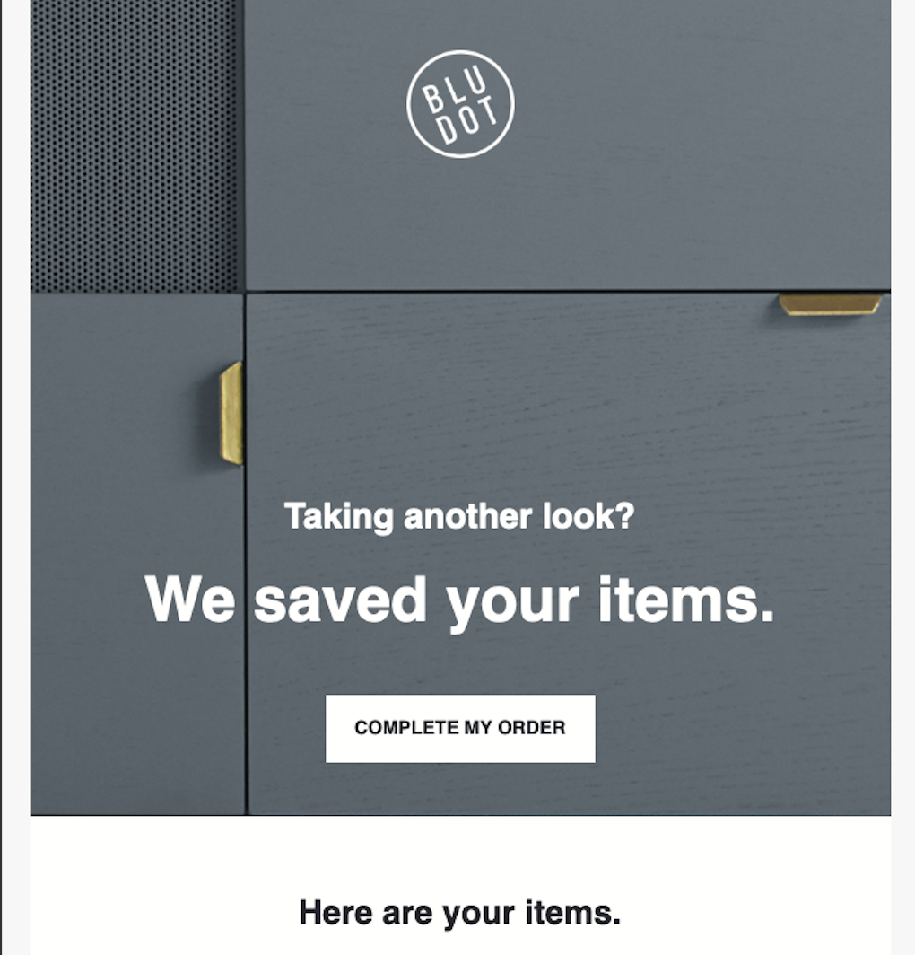
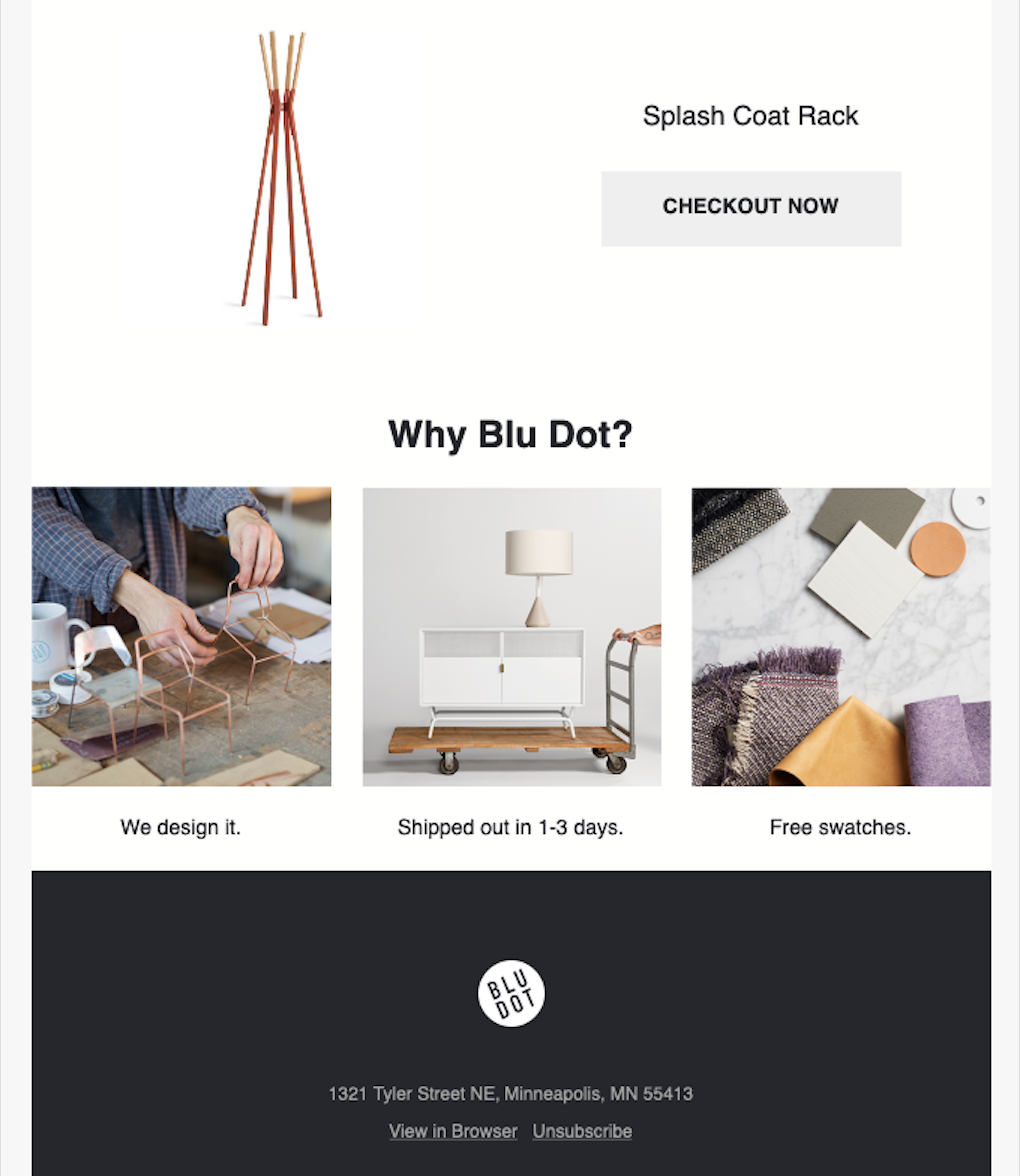
7. Blu Dot
- Subject Line: Wait up. Your order is not complete.
Known for its modern, contemporary furniture, you get that same vibe in Blu Dot’s email design. Some of the other pros about this abandoned cart example include:
- The subject line catches the shopper’s attention and lets them know they need to take action.
- They share things that set their brand apart: “We design it. Shipped out in 1-3 days. Free swatches.” Any time you can show what makes your brand special, do it.
These are a few things we think should have been avoided to get the best response:
- The product they left behind gets a little lost in this design because there’s another large image above it that doesn’t really add anything to the message. Have the product at the top of the email, below just a header text and logo. That will make sure they see it right away, especially if they are viewing it on a mobile device.
- They include information on how quickly their products ship, which is great, but we wish they would have added something about the shipping costs. Even if the costs vary, they could put something like, “Ships in 1-3 days for as little as $4.99.” That at least gives the shopper an idea of the starting price.
- We know we keep saying it, but we like seeing a product’s price in a cart abandonment email.
- They could have included some related products in case the main one in their cart isn’t exactly what they’re looking for.
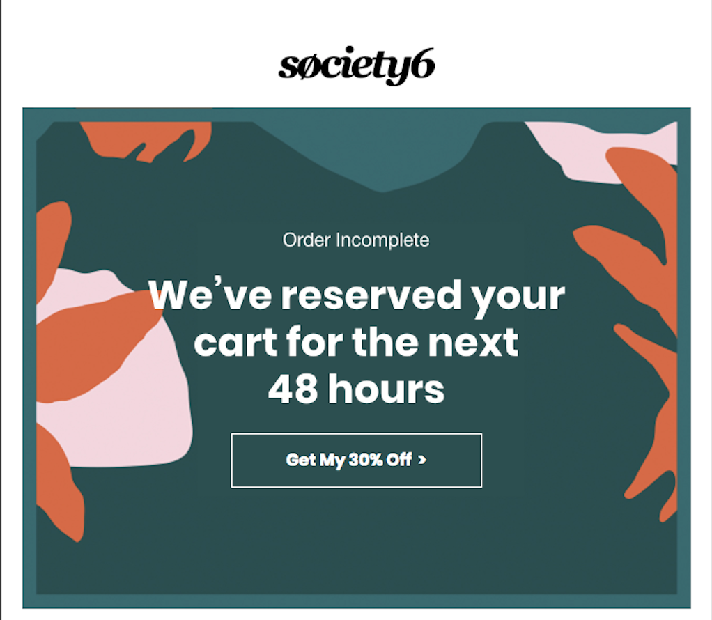
8. Society6
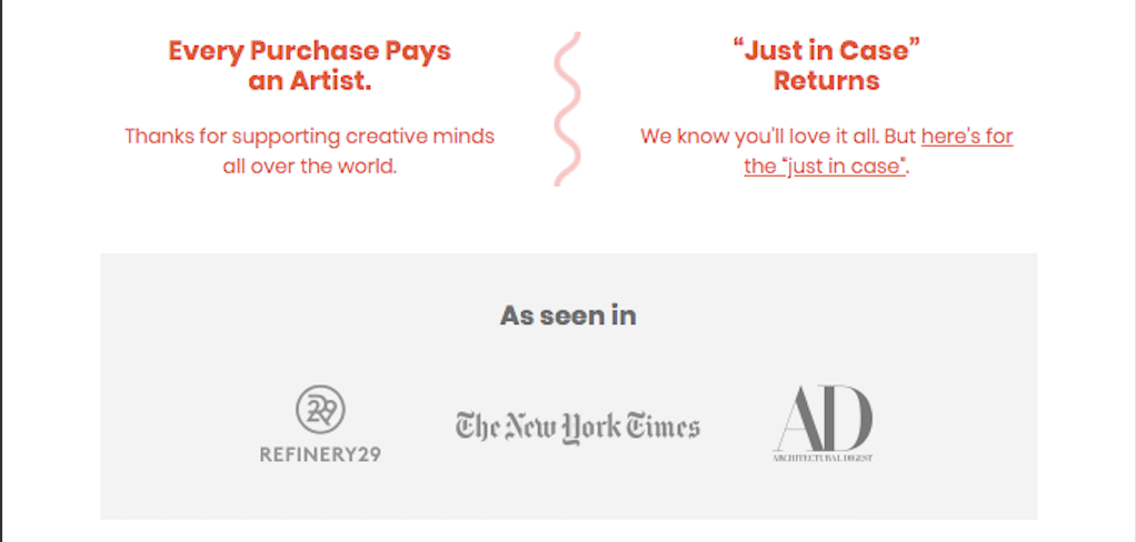
- Subject Line: Cart reserved (with the best offer available)
This email from Society6 really lays it all out there. There’s no messing around with this example. The brand lets the shopper know their cart is incomplete, and they need to take action ASAP if they don’t want to lose those items: Because no one wants to have to go looking for items again.
If that wasn’t enough goodness, we are also loving these other components they put into this email:
- They offer a 30-percent discount, which is a pretty large amount.
- They show they are only reserving the items for 48 hours, pushing shoppers to go complete their purchase now.
- There’s information about returns at the bottom, along with a feel-good reminder that your purchases help pay artists.
- By including the “As seen in” section at the bottom, they give their brand some credibility.
While we love the design of this email and some of the components, there are some things it could do better — especially one big thing:
- There’s one major thing missing from this email: There’s no photo, description, or mention at all to what was left in their cart. That’s kind of a big deal because you want the shopper to know what they’re missing out on.
- If they really wanted to amp up the urgency, they could make the discount good for only those 48 hours too.
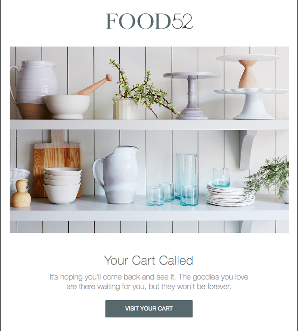
9. Food52
- Subject Line: Ooh, good choice! We set it aside for you.
Who doesn’t like being told that they made a good decision or have nice taste? We’ll take those compliments all day long, and that’s exactly what Food52 does with that subject line.
Once the shopper opens the email, they are greeted by fun, light-hearted content: “Your Cart Called. It’s hoping you’ll come back and see it.” They follow that up by reminding the shopper their items won’t be there forever (will see that in the next example).
- We always like when brands find different verbage to use in abandoned cart examples (or any campaign, really), and we like how they call the products “You lil’ somethings.”
- The two CTAs — “Visit Your Cart” and “Shop Now” — are clear and to the point.
- The email is on brand and not overwhelming with photos and text.
What we would have liked to see them do a little better:
- The product isn’t visible in the top half of the email. We’d like to know straight out of the gate what we left to decide if we want to go back and purchase it.
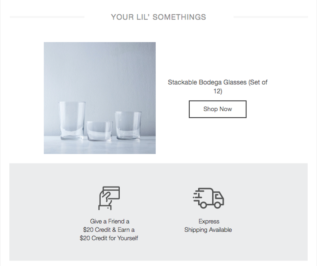
10. Food52 (again)
- Subject Line: Going fast: grab the items in your cart before they go poof.
Creating a series of abandoned cart emails is a great practice because maybe one email’s approach will work better than another. You can space these emails out by a few days and hope one of them catches the shopper’s eye.
While the email in the example above lets them know the brand saved their items in their cart for them, this email lets them know those items might now be gone from their cart: “Oh no! We had to let the treasures saved in your cart go. But you might just be able to snatch them up again. Let’s take a look, shall we?” Pretty slick, right?
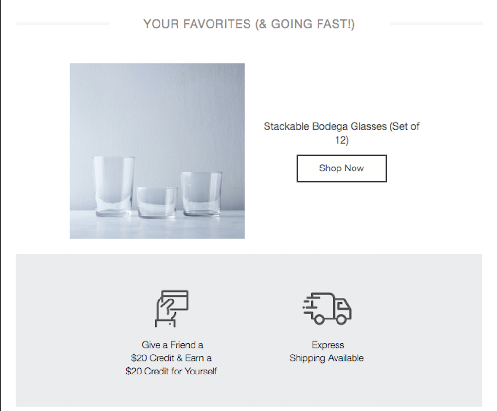
Here’s what else we like about this email:
- They include the product they had in their cart as “Your Favorites,” and they also say that they are going fast (more urgency).
- There’s information on a referral program that can earn them and a friend a $20 credit each.
- They let them know that they offer express shipping (although including what that means could make it a little clearer and a more attractive option).
Of course, we’ll mention a few things that might make this example better:
- Taking products out of their cart could deter them from going back to the site because they don’t want to take the time to do that again. However, they do include a “Shop Now” CTA for the product, so maybe that solves the problem.
- They could have included the product price, along with other recommended products.
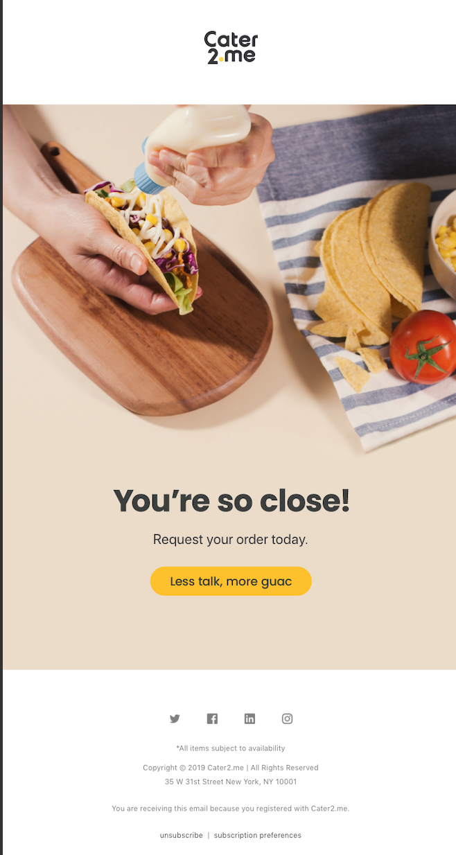
11. Cater2.me
- Subject Line: Finish Ordering for Cinco (or Tres or Seis) de Mayo!
From the subject line to creative CTA, this email from Cater2.me has it all. And since it’s short and sweet (or maybe savory since there are tacos involved), we’ll get straight to what we love about it:
- The main image makes us hungry, so we’re guessing it’s going to have the same effect on their shoppers.
- As we mentioned, the CTA, “Less talk, more guac,” is fun and makes us want to click-through.
What would make this email even better? Here’s one idea:
- I’m guessing shoppers who received this email were about to order a meal around Cinco de Mayo. But, it would have been nice to see the exact food items they viewed and put in their cart below the main taco image.
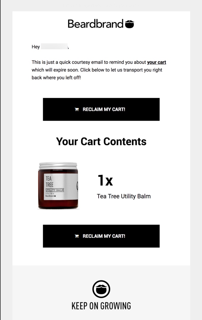
12. Beardbrand
- Subject Line: Quick heads up...
Something we haven’t seen in the other examples yet is a personalized greeting. Those can be a great way to engage your shopper and remind them you sent this email just for them. We all like feeling special and not like a number. Check out these other components that we like from Bearbrand’s example:
- There are two CTAs, so one of them will be showing up on your screen no matter how far you’ve scrolled.
- They also included a link to the cart in the email’s text.
As always, here are a few things we would have liked to see done differently:
- There’s a slight “business transaction” feel to this email with the opening line, even though they do personalize the message with the subscriber’s name.
- While we like the two CTAs, they could have used different wording on one of them to test out which version performed the best.
- We’ll say it again for those in the back: We want to see the product’s price.
- They could have included more information at the bottom, like about shipping, returns, what makes their products better/special.
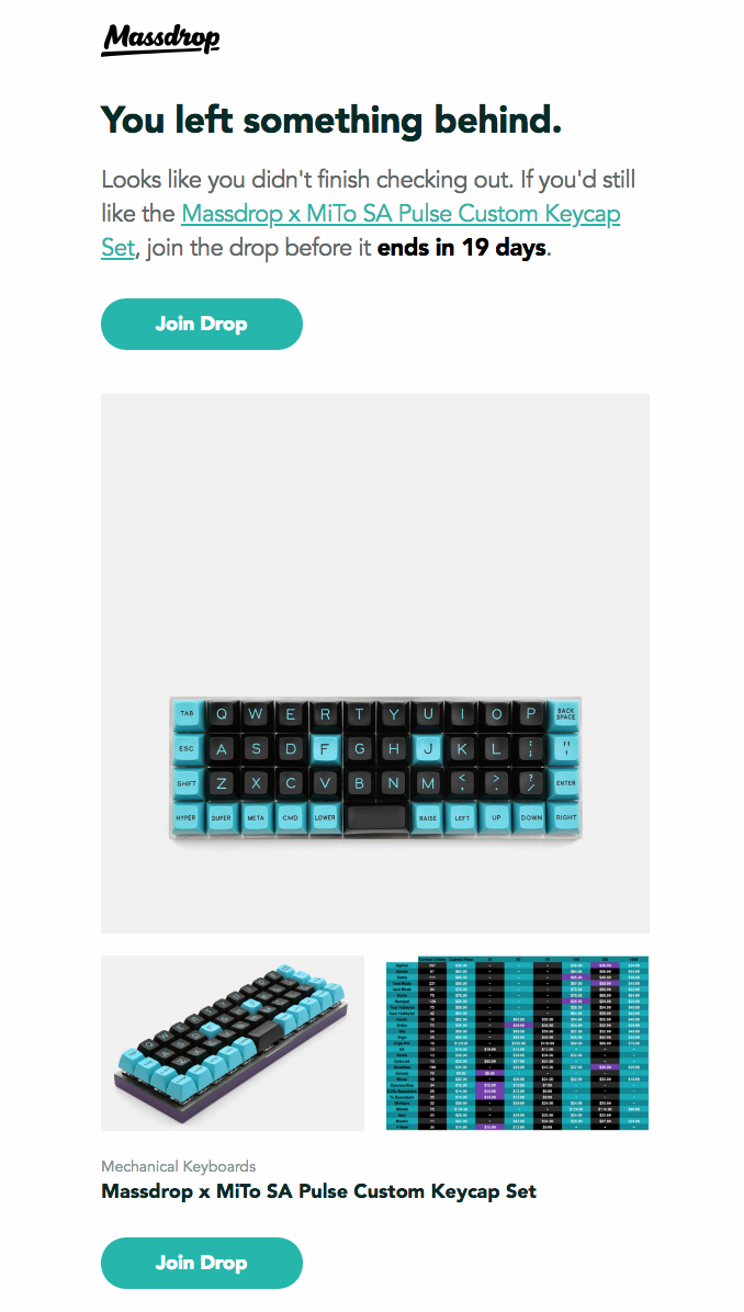
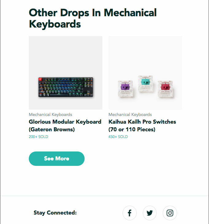
13. Massdrop
- Subject Line: [NAME], still interested in the Massdrop x MiTo SA Pulse Customer Keycap Set?
Though the company has since changed its name to Drop, we like this cart abandonment email they put together. They make it clear why they are emailing this subscriber: “You left something behind” and “Looks like you didn’t finish checking out.”
- There’s a deadline for when this product will no longer be available, pushing the shopper to head back right away.
- They include related products and show how many have been sold, providing social proof and urgency to get one before they’re gone.
Without further ado, we’ll jump into what we think could make this abandoned cart example even better:
- While we love the level of personalization they put in the subject line, it’s pretty long, especially for users reading it on their mobile devices. Instead of including the full product name, they could have used only the category (ex. Mechanical Keyboard).
- There’s a lot of white space at the top of the product photo, so readers will only see a blank image if they don’t scroll down. It would work better if the photo was cropped.
14. Peel
- Subject Line: Still thinking it over?
It can be hard to put a personal touch on a branded campaign, however Peel does a great job of making it seem like it came from a real person. They include their founders’ names, signatures, and Twitter handles, which really helps shoppers feel more connected to the brand and people behind it.
- We like the vagueness in this email subject line because it makes us interested in what they’re asking about — which is going to lead to opens. It’s OK not to spell out exactly why you’re emailing them if you catch their attention enough to make them want to see what’s inside, as long as you deliver in the email.
- They include the product’s price, so you know we’re loving that.
- Their shipping information, “Free shipping on orders over $49,” is right there at the top — along with a menu bar that helps readers learn more about the brand.
As with all of these abandoned cart examples, we have to figure out a few things that might have made it better:
- We don’t love how they use the same wording, “Still thinking it over?” for both the subject line and inside the email. The header content inside of the email could be the answer to the subject line like, “Don’t wait too long.”
- There’s a lot of black in the design, and since the product is also black, it kind of gets lost. The photo also seems small given the other proportions.

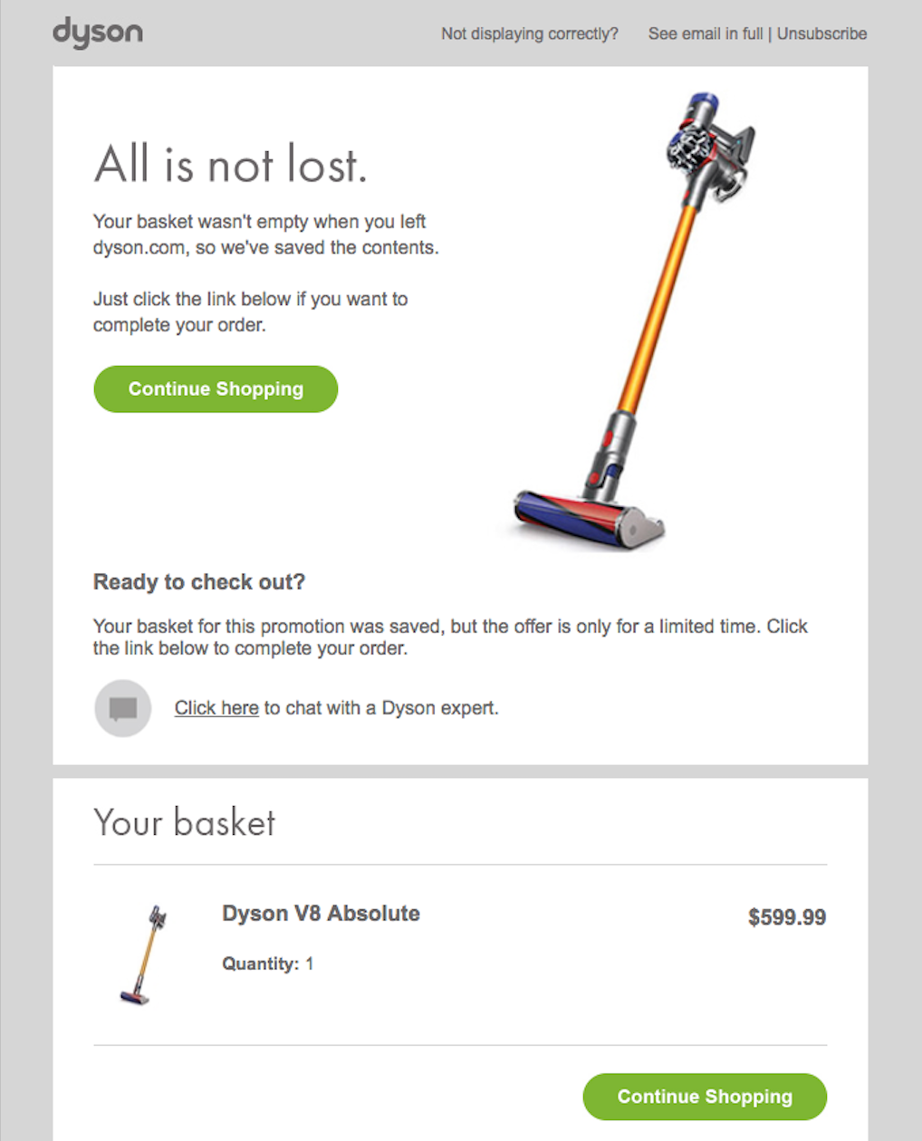
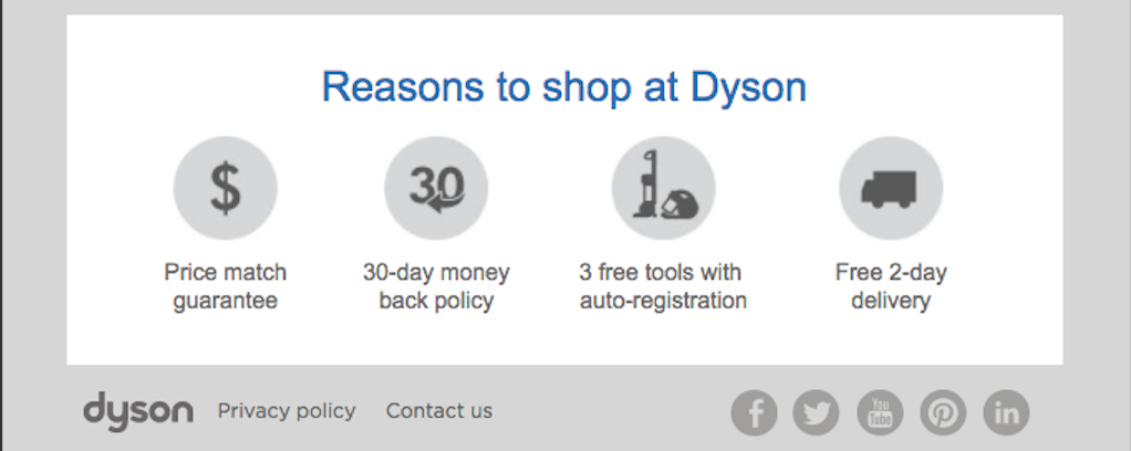
15. Dyson
- Subject Line: Items in your basket at dyson.com
Anytime you can set your brand apart, you’re making some real progress with online shoppers and consumers in general. That’s what Dyson does at the bottom of this cart abandonment email with the section, “Reasons to shop at Dyson.”
They hit on several potential issues that could keep a shopper from converting, including showing they offer a price-match guarantee, 30-day money-back policy, free tools, and free 2-day delivery (which is a great turnaround that competes with Amazon).
Check out these other tactics they use to bring shoppers back to their carts:
- They show the product, product name, and the price, so we know exactly what we’ll see if we click the CTA.
- Speaking of those CTAs, they really pop, don’t they? You aren’t going to miss those, and that’s the whole point.
- Part of the reason those CTAs work so well is that the overall design is clean and simple, so another plus for that.
We can’t help but think the brand missed out on the opportunity to use a vacuum pun in their email, such as, “Don’t let this offer get sucked away,” or “Time to clean out your cart.” When you have the products to back it up, go for the puns!
And here are a few other things we noticed:
- The line, “Your basket wasn’t empty when you left dyson.com,” doesn’t make us want to go back. Really, we aren’t even sure we left something there by that wording. That’s like telling you your cat is lost by saying, “Your cat isn’t at home.” It’s a passive tone that needs to get straight to the point like, “You left things in your cart.”
- Again, the wording, “Your basket for this promotion was saved, but the offer is only for a limited time,” is also a bit vague for us. Something stronger would be, “We saved your promotion, but it won’t last for long. Check out now!” You want your copy to be as clear and concise as possible.
- We think the subject line could be a little stronger, as well, maybe saying, “You left items in your basket at dyson.com.”
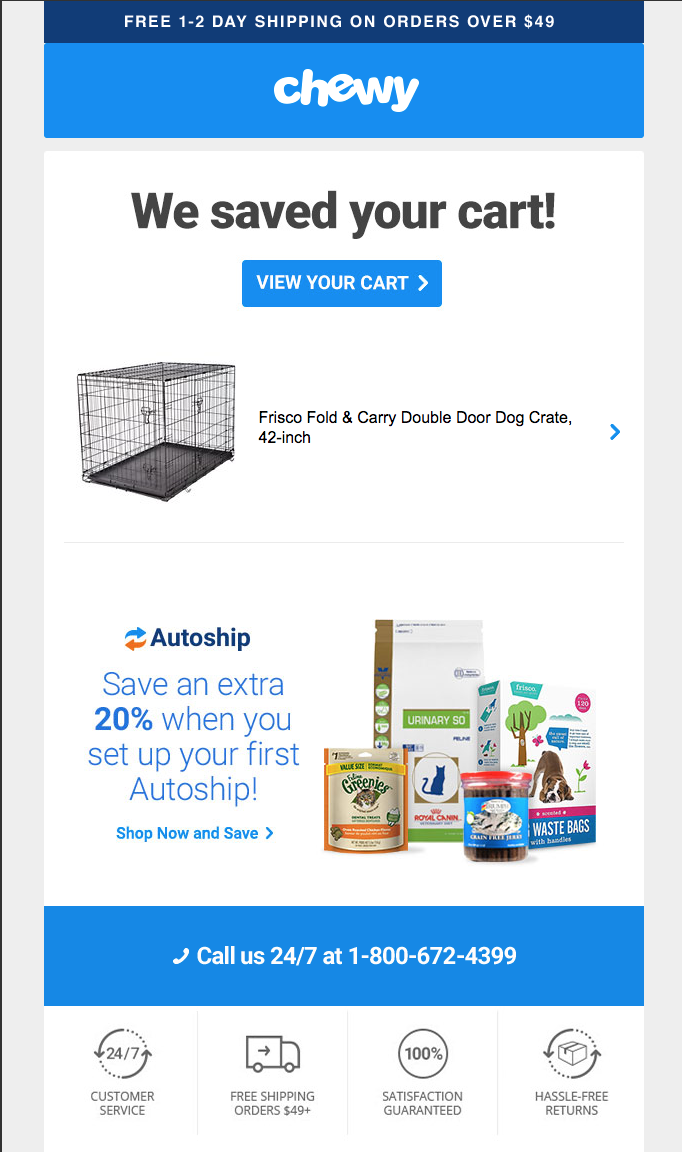
16. Chewy
- Subject Line: Forgot something?
This email from Chewy shows a complete thought process of getting the shopper back to their cart. First, the subject line asks if they forgot something. That’s followed up by telling them they saved the item they forgot — and hey, there’s a photo of it in case they don’t remember what it was. And to round out that digital conversation, there’s a CTA to “View Your Cart.”
It’s a cohesive progression of copy that works well with the other components:
- Right there at the top, they show they have free 1-2 day shipping on orders over $49. So, shoppers won’t have questions about that if they head back to their cart. That can also encourage them to spend more so they can qualify for that free shipping.
- They include a way the shopper can save an extra 20 percent by mentioning that shipment option.
- And at the bottom, they mention their 24/7 customer service, shipping again, and returns policy — all things that could have possibly kept someone from making a purchase.
As for components they could have improved on:
- This is such a small thing, but we would have rather the subject line say, “Forget something?” But sometimes it’s the small things that make all of the difference.
- Of course, they could have included the product’s price and other similar products.
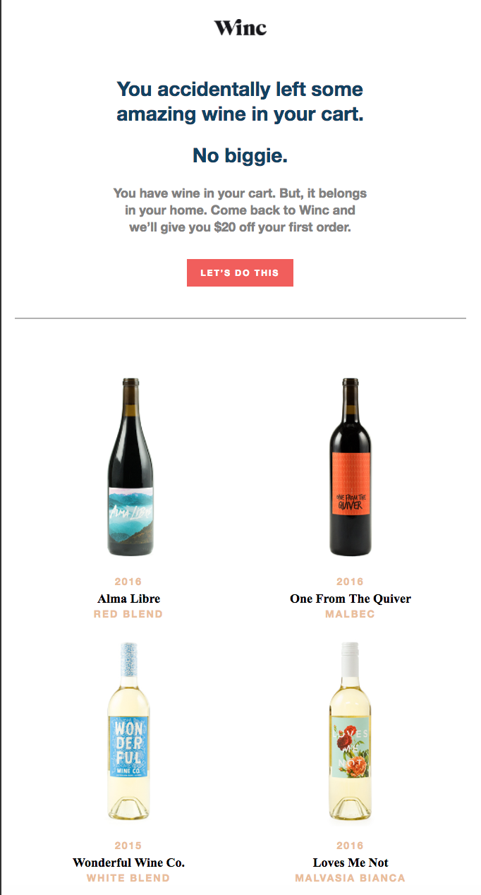
17. Winc
- Subject Line: You forgot something unforgettable.
It doesn’t get much sweeter than wine and a discount, right? That’s what Winc is hoping for with this email. Offering a $20 discount sounds pretty nice for a first purchase, and they top that off with a clean design.
But those aren’t the only things we’re enjoying:
- The “Let’s Do This” CTA is something different than you see in most abandoned cart examples, and it fits in well with the overall brand voice of the campaign.
Here are a few things that could make this wine more fine:
- Besides the fact that there’s wine in their cart, it’s unclear what exact wine they left behind. Did they leave all four of those bottles, or are those simply suggestions?
- They repeat the same basic phrase twice about having left wine in their cart. They could have cut the second instance, “You have wine in your cart.”

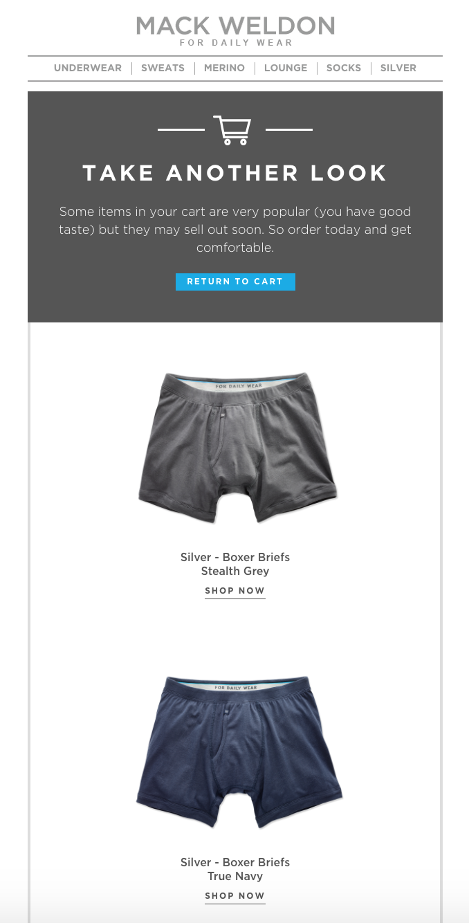
18. Mack Weldon
- Subject Line: You left something comfortable in your cart
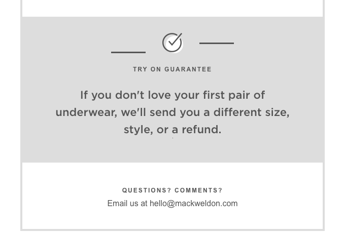
We don’t know about you, but purchasing clothes online — especially items as personal as underwear — can be a bit tricky since you can’t try them on until they arrive. That’s why we like how Mack Weldon’s email makes their guarantee a large part of this email.
If a shopper doesn’t love what they receive, they can get another pair or a refund. That’s a big selling point and one that could be the reason why the shopper goes back to their cart. Check out these other things we like about this example:
- We like how the subject line uses something that’s unique to their products in the subject line, saying they left something “comfortable.” They aren’t naming the specific product, but it gives a brief description of what they’re missing out on.
- The shopping cart image at the top of the email lets them know right away why they are receiving this message.
There are no glaring issues with this one, but here are a few ways they could make it even better:
- Include the price. There, we said it again.
- They could have made the “Shop Now” CTAs more prominent, either by putting them in a blue square like the CTA at the top or putting them in a full box.
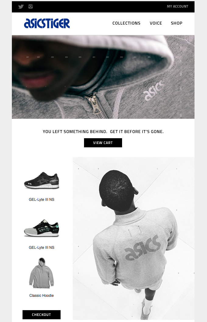
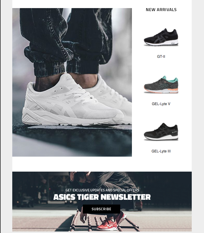
19. ASICS
- Subject Line: Did you leave something behind?
The answer to that subject line is, “Yes, they definitely did, and now we’re going to tell you why you need to complete your purchase!” OK, maybe that’s coming on a little too strong, but ASICS’s approach works just as well: “You left something behind. Get it before it’s gone.”
We like how they:
- Get straight to the point and remind the shopper the items they like might not be around forever.
- Show new arrivals because consumers want to be on-trend.
- Offer them a way to subscribe to their newsletter at the bottom to receive exclusive updates and special offers. Someone who adds something of yours to their cart is definitely a qualified lead who might be interested in your newsletter.
As for things that could have made this email better:
- There are no prices (tired of hearing us mention that yet?).
- There is only one CTA for all three items in their cart, as opposed to separate CTAs for each item. While you don’t want to overwhelm them with buttons, you also want to give them a chance to only click on one item, if that’s the one they’re most interested in. Maybe they don’t care about the other items, which might deter them from going back to their cart. (Yes, we know the other items will still be in their cart, but you need to make it as attractive as possible to get them back there. Then, they can remove what they don’t want.)
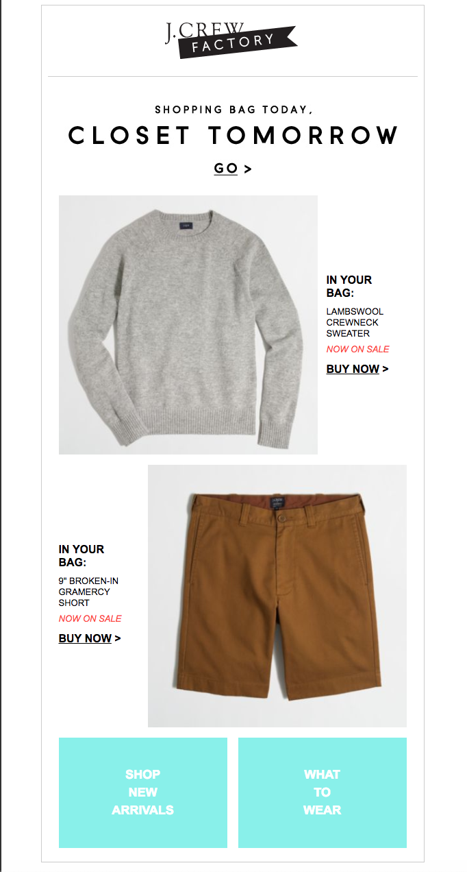
20. J.Crew
- Subject Line: Something just happened in your shopping bag
Though we’re not sure if it’s actually possible for something they order out of their cart to arrive at their home (and closet) tomorrow, it’s a strong way to start off this J.Crew email. Here are other aspects we like about this abandoned cart example:
- We like how the photos are staggered, instead of being stacked on top of each other. It makes them stand out more.
- The CTAs aren’t your normal boxes, but they are all uniform with the “>” next to the text — so that works!
What they could have done a little better (in our humble opinion):
- The subject line says that something happened in the shopping bag, but I’m not really sure what they’re getting at by reading the email. Because the items are now on sale? If that’s what they mean, it needs to be a little clearer.
- They say the products are “Now on sale,” but they don’t say what the discount or price is. This would be a great place to put a marked out price with the new one — or at least tell the amount of the discount.
- When we first saw this example, we thought the blue boxes at the bottom for “Shop New Arrivals” and “What to Wear” were place holders that they forgot to update. The color, text, and large size of them seem really out of place in the design.
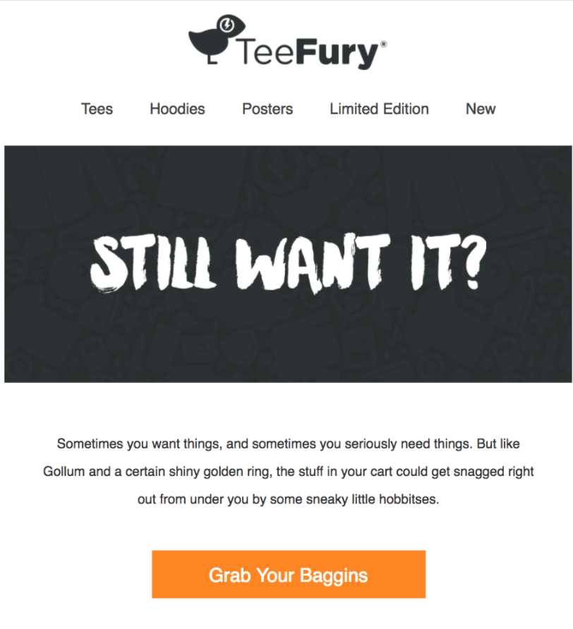
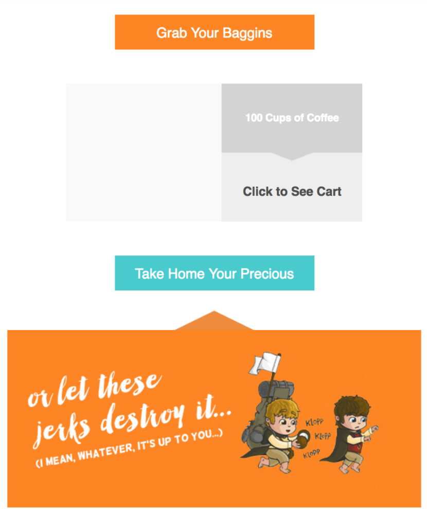
21. TeeFury
- Subject Line: Where’d you go?
Let’s be clear: We are huge nerds who have an unhealthy relationship with all things Lord of the Rings — or really any fantasy novel. Now that we’ve got that out of the way, you can better understand why we are in love with this example from TeeFury. (I mean, do you know of any other email campaigns that mention hobbitses? Yea, that’s what we thought.)
This email has some other great things going on too:
- They really went for it with the Lord of the Rings references. They even created images based around it, for goodness sake.
Here’s one thing we aren’t quite sure about:
- Whether it’s a glitch on our end or it was never included, there’s no product photo showing up. You definitely want the shopper to see what item they are missing out on.
- Sorry, we can’t bring ourselves to say anything else negative about this Tolkien tribute.
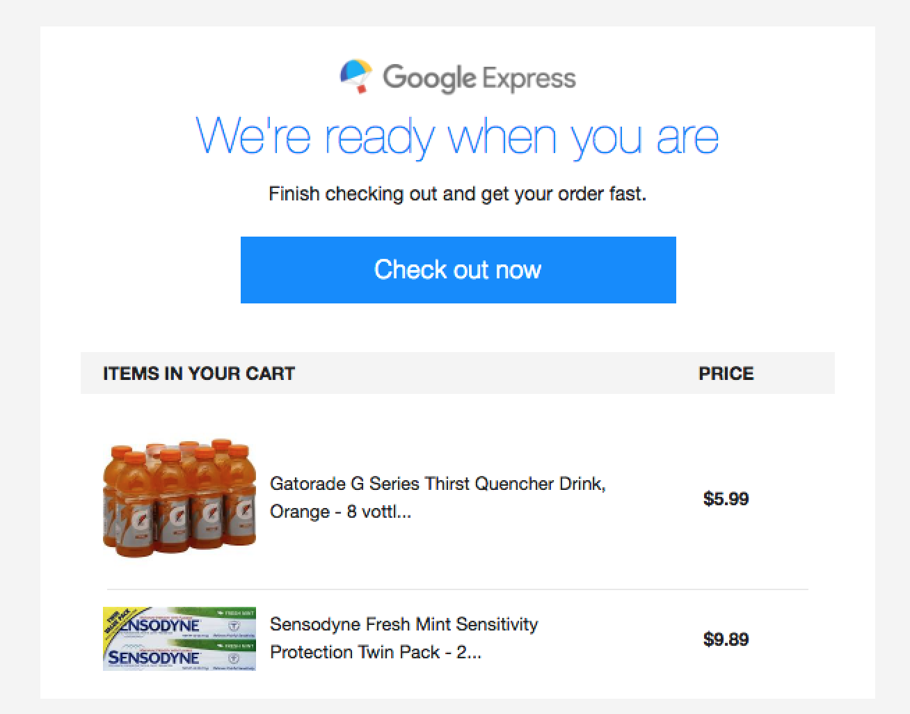
22. Google Express
- Subject Line: Complete your order with Google Express
There’s no pushy language in this email from Google Express, and we like that. A simple, “We’re ready when you are,” followed by letting them know they can finish their order works for this type of campaign.
Here’s what else we like:
- It’s a fairly short email, especially compared to the ones above. So, they only include one CTA, which works for this length.
- Since this is more like grocery shopping, there’s no real reason to offer comparable products. Most people are going to get what they always order, unless there’s a sale, so this approach works great.
- Of course, we also love how they include the price.
What could have been a little better:
- The product descriptions are cut off. We understand these are automated and the content is pulled in. However, maybe only use the main name, like “Gatorade G Series Thirst Quencher Drink.” The image lets them know what it is, and if they really want more info, they’ll click through anyway.
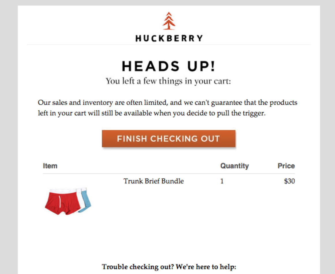
23. Huckberry
- Subject Line: Heading out without checking out?
Rhymes are always fun, so we enjoy this subject line from Huckberry. Once the shopper is inside of the email, they will be reminded they need to take action before their items are gone: “Our sales and inventory are often limited, and we can’t guarantee that the products left in your cart will still be available when you decide to pull the trigger.”
The brand is putting it all in the shopper’s court, while also subtly letting them know their products are popular (if there’s a chance they could be gone).
Here are other things they did right:
- This is what we like to see with products that people might purchase multiples of (ex. underwear, grocery items, etc.). They show the product photo, description, quantity, and price. Everything the shopper needs to know is right there, giving them the information they require to take the next step.
- Maybe the shopper had a technical issue or other problem when they went to check out. The brand addresses that by including, “Trouble checking out? We’re here to help,” along with their contact information.
What they could have improved on:
- They could have included other similar or popular products in this category.
Abandoned cart emails are about much more than a sale
Don’t get us wrong: We like making a sale as much as the next guy. However, if that’s all you’re after, you’re missing out on the bigger, more important picture. Your abandoned cart emails should be focused on building long-lasting relationships with your audience, not simply a sale.
Because if you’re able to earn their trust and loyalty, you can know they will be back again. If not for this product, then the next one they see.
That means you want your email to not only tell them they left something in their cart and what that something is, you want to engage with them. For example, include a way for them to contact you if they have questions. (And actually respond to those questions in a timely manner.)
Or, let them know how they can connect with you on social media or through your newsletter. Again, you’re in this for the long run, not simply a one-off sale. That’s how you turn shoppers into loyal promoters of your brand.
Best practices
Just as a reminder, here are some of the important elements to consider when building your abandoned cart email:
- CTA: You want to get the shopper back to your site, and that’s where your CTA comes in. Make sure the design of the CTA stands out from the rest of your email. The text should also clearly let them know why they need to click. For example, “Return to your cart,” “Buy Now,” or “Complete your order,” are pretty clear.
- Personalized approach: These emails should be personalized because only that specific shopper left those specific items in their cart. So, let them know exactly what they left and related products to those items. You can also include their name in the email or subject line to top it all off.
- Timing: This is a big one. You want to send your abandoned cart emails within a few hours after the shopper left their cart behind. That ensures the product is still fresh on their mind and also catches them before they possibly make a purchase on a competitor’s site.
- Content: These emails aren’t normally very long, so you want the copy that’s there to be concise and engaging. It should make them want to head back to their cart to complete their purchase. If you can do that with your copywriting, you’re doing great.
- Subject line: It’s the first thing they’re going to see and what will ultimately decide whether or not they open your email. We’ve included more than 20 examples already, but try out ones that include discounts, their name, emojis, what they left, and anything that will catch their attention. You can use A/B testing to see which ones perform the best.
Take what you’ve learned from these abandoned cart examples to craft an automated campaign that’s uniquely designed for your brand and audience. You have the tools, so now is the time to get started!